Creating and exporting figures in R can be tedious for beginners or intermediates. Therefore, I created a ggplot2 template for figures that follows the formatting requirements of the Science Magazine.
Using R is challenging for beginners and intermediates on several levels. As a supervisor I often get asked if a figure looks nice or what is supposed to be changed. While many elements of a successful figure are dependent on what you want to display, there are still some aspects that you can generally apply. Thus, to save some time, I created a template when we were submitting our study to Science. The template replicates some of the key formatting requirements set out by the Science Mag.
How does it work?
When you start a new session in R, all you need is to run the code at the end of this post. The script will adjust (set) your theme in ggplot2 in such a way that all figures follow this format. This also gives all your figures consistency, such as identical line thicknesses, labels, and the general look.
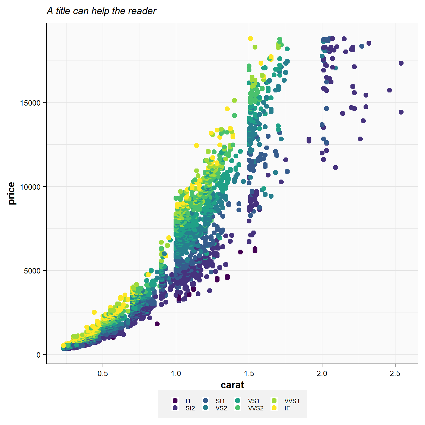
Here is a very basic example of how the theme looks using the diamonds dataset without any additional formatting.
How large should it be?
The theme is only one part of this script though. In publishing , you are always required to provide figures in a certain width. The width depends on how many “columns” you want to use for your figure. In the Science Magazine, the layout has three evenly spaced columns, thus you will have to decide if you use 1, 2 or 3 columns (see Figure 2).
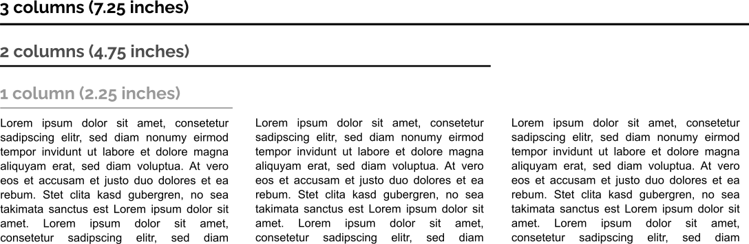
In Figure 1, I decided to use a width of 2 columns due to the abundance of data points. In the code below, you will also see that there are three objects created, named cw1, cw2, and cw3. “cw” stands for column-width. As you have guessed correctly, these objects store the column widths as shown in Figure 2. Thus, when you have created your figure and decided on the width of it, all you have to do now is saving it.
Saving your plot
To save your ggplot, I would recommend using the ggsave() function. Here you can define the exact width (and height) of your figure, as well as its resolution (if it is raster-based). In the example (Figure 3), I stored the figure as plot1 and saved it with ggsave().
If you do not know the difference between raster-based (e.g., .png) and vectorized images (e.g., .svg), then I’d recommend checking out my R-beginners guide. At the end of the video series, I go into detail about colors, image properties, etc., generally covering the basics that you should be familiar with when creating graphs and figures. The essence of it: raster-based images have a set number of pixels and you cannot easily modify individual objects of an image. Also, if you zoom in, the image gets “blurry”. Vectorized images do not have such a loss of quality and you can select and modify individual objects of the image. However, vectorized images can become large quickly, if you have many individual or complex elements.
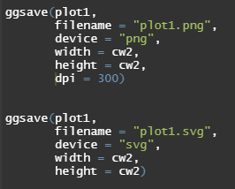
I decided to save the image with the same height and width, so that it is perfectly square. Thus, I set the width = cw2 and the height = cw2. In other cases, you may want to have a figure that is twice as wide as it is high. In such a case, you could set width = cw2 and height = cw2/2, achieving an exact 2:1 aspect ratio.
The result
If you exported the image with the code in Figure 3 and inspect the axis title, you will see that it will always be of size 8pt. The legend is of size 5pt. You can go with larger font sizes, but especially in multi-faceted plots you will lose lots of space to labels that way and you figures may look cramped.
Now if you insert your image into any document, then it should be exactly 4.75 inches wide. You can also use this to your advantage for presentations, when you want to create a figure with an exact size and high picture quality. For instance, if you have a wide-screen power point presentation (13.3 inches wide). You want to denote exactly 2/3 of the width for a figure, then you can export it with exactly 8.86 inches width, providing the perfect fit.
Why?
You may still ask yourself, why go down this route?
First, you will have to follow specific requirements every time that you submit a paper, so better get used to it directly. Secondly, if you export your images in R via the export function (or worse, screenshot them), then your image will always be a bit too large or too small. Thus, you will crop or scale it afterwards, which makes it blurry and also increases the actual font size of all your text. Thus, one image in your master thesis may have axis labels that are of 9.5pt, while the next is in 8.33 pt. This gives your work an unprofessional look. Third, once you get used to it, you will be faster this way and more consistent.
The Code
Here is the code for the ggplot2 template for figures. You can play around with it, maybe increase the legend-label sizes or background colors. You will quickly get an idea about your personal preferences and you can adjust the template accordingly.
windowsFonts("Arial" = windowsFont("Arial"))
loadfonts(device = "win")

## Clean theme:
theme_set(theme_bw())
theme_update(
  # Text
  text = element_text(family = "Arial"),
  # Axes
  axis.title = element_text(face = "bold", size = 8),
  axis.line = element_line(color="black", size = .25),
  axis.text.y = element_text(color="black", size = 6),
  axis.text.x = element_text(color="black", size = 6),
  axis.ticks = element_line(color="black", size = .25),
  # Title
  plot.title = element_text(face = "italic", size = 8),
  # Legends
  legend.title =  element_blank(),
  legend.position = "bottom",
  legend.text = element_text(size = 5),
  legend.key.size = unit(0.4, "lines"),
  legend.box.spacing = unit(0, "cm"),
  legend.background = element_rect(fill = "gray95"),
  # Panel
  panel.border = element_blank(),
  panel.background = element_rect(fill="gray98"),
  panel.grid.major = element_line(color="grey90", size = .25),
  panel.grid.minor = element_line(color="grey90", size = .15)
)
loadfonts(device = "win")

## Margin sizes according to Science formatting requirements
# Widths

# 1 column = 5.5 cm / 2.25 in
cw1 <- 2.25
# 2 column = 12 cm / 4.75 in
cw2 <- 4.75
# 3 column = 18.3 cm / 7.25 in
cw3 <- 7.25
Jakob Wolfram is part of the MAGIC research group, which focuses on large spatio-temporal assessments of chemicals impacts on the environment.